Scatter Plots and Histograms
A line plot connects consecutive points, which is appropriate when the \(x\)-values are ordered. For a collection of points with no inherent order, line plots are the wrong visualization method because they suggest a connection between consecutive points. Consider the following example of plotting points drawn randomly from the unit circle.
# Sample 100 random angles between 0 and 2π.
theta = np.random.uniform(0, 2 * np.pi, size=100)
x = np.cos(theta)
y = np.sin(theta)

plt.plot(x, y)
plt.axis("equal")  # Set the x and y units to have equal length.
plt.show()

A different type of plot is needed to visualize this data effectively.
Scatter Plots
A scatter plot draws a set of points as dots without lines between them.
Plot Method
A scatter plot can be created with plt.plot() by specifying a marker style instead of a line style, or by setting linewidth=0.
Argument |
Options |
|---|---|
|
|
|
|
|
|
|
|
# Plot circles in the default color and size.
plt.plot(x, y, "o")
plt.axis("equal")
plt.show()

# Plot small stars in the second default color.
plt.plot(x, y, linewidth=0, marker="*", ms=4, mew=0, color="C1")
plt.axis("equal")
plt.show()

The alpha keyword argument specifies marker transparency.
# Plot large transparent squares in the third default color.
plt.plot(x, y, "s", markersize=20, mew=0, color="C2", alpha=0.1)
plt.axis("equal")
plt.show()

Scatter Method
The function plt.scatter() creates scatter plots and has many of the same keyword arguments as plt.plot().
However, several arguments to plt.scatter() can be set to arrays, which is very useful for dealing with multi-dimensional data.
scontrols marker area, measured in points squared. This can be a single number or an array that specifies the area for each individual point.colorcontrols marker color. This can be a single color or an array that specifies the color for each individual point.alphacontrols marker transparency. This can be a single value between0and1or an array that specifies transparency for each individual point.
# Make markers larger and more transparent if they have a larger angle.
plt.scatter(x, y, marker="o", s=theta**3, alpha=(1 - theta / (2 * np.pi)))
plt.axis("equal")
plt.show()

Note carefully in the previous example that theta is an array of the same size as x and y, so s=theta**3 assigns a different marker size for each data point.
As with plt.plot(), plt.scatter() has a label keyword argument that populates the text of the legend when plt.legend() is called.
Uploading Files to Google Colab
To use a local file in Google Colab, click on the left sidebar to open the file browser, click the upload button , and select the file. The uploaded file will be available in the current session by its filename. Data files are deleted between sessions, so if you close the notebook and reopen it you will need to upload the files again.

Upload the file econ_data.npz to Google Colab to complete the following problem.
Problem 4
The file econ_data.npz contains three 1D NumPy arrays representing the annual gross domestic product (GDP) in trillions of US dollars, average life expectancy in years, and total population for 48 fictitious countries. Upload the file to Google Colab, then load it into Python with the following code.
econ = np.load("econ_data.npz")

gdp = econ["gross_domestic_product"]
life = econ["life_expectancy"]
pop = econ["population"]

# Sanity check that all three arrays have the same size.
print(len(gdp))
print(len(life))
print(len(pop))
48
48
48
Make a scatter plot exploring this dataset.
Plot life expectancy against GDP and label the axes accordingly.
Encode a third variable by setting the marker size to the population, divided by the largest population, then multiplied by 1000.
Choose
alphaso that overlapping markers remain visible.Add the title “Problem 4”.
Create the figure in a single cell ending with plt.show().
Finally, in a Markdown cell below the figure, briefly describe (two or three sentences) what the figure shows. Is there a visible trend between GDP and life expectancy? Do any countries stand out as unusual? What other insights does the figure show?
Histograms
Line and scatter plots display relationships between two variables, \(x\) and \(y\).
A histogram instead summarizes the distribution of a single variable by dividing its range into intervals, called bins, and drawing a bar whose height is the number of values that fall into each bin.
The command plt.hist(x, bins=n) draws a histogram of data x with n bins.
The following code creates a histogram of the \(x\) values from the points randomly drawn from the unit circle.
plt.hist(x, bins=20)
plt.xlabel(r"$x$ values from random points on the unit circle")
plt.ylabel("Number of points")
plt.show()

A histogram gives a quick picture of the distribution of a dataset. The above figure shows that the \(x\) value of a point randomly picked on the unit circle is more likely to be close to \(-1\) or \(1\) than it is to \(0\). There is no major bias toward one side or the other: a point appears to be about as likely to have a negative \(x\) value as it is to have a positive \(x\) value.
Example: Exam Scores
Consider a collection of exam scores, stored in exam_scores.npy as a NumPy array. Each number in the array represents one student’s score. To see how well the class did, visualize the data with a histogram.
scores = np.load("exam_scores.npy")

plt.hist(scores, bins=10)
plt.xlabel("Exam score")
plt.ylabel("Number of students")
plt.show()
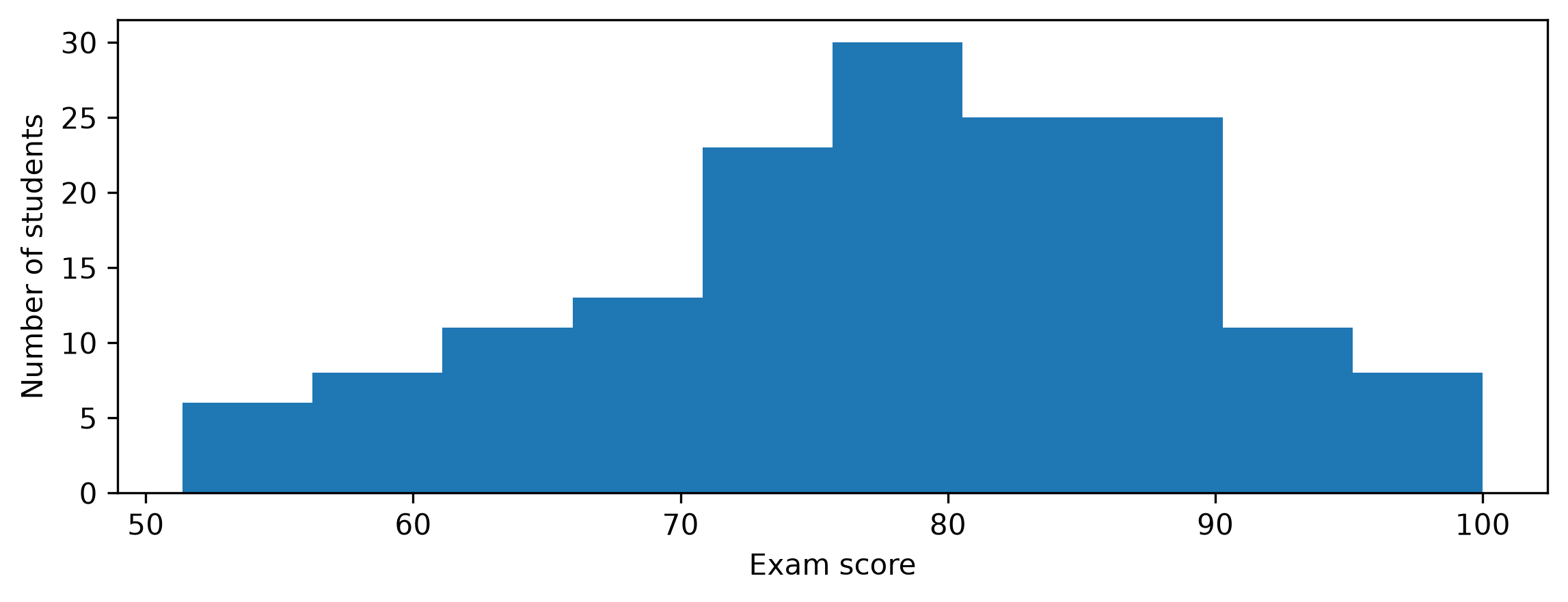
A bar in this histogram usually does not represent one student; instead, it represents all the students whose scores fall inside that bin. For example, about 6 students scored in the mid-50s, while 7 or so students scored in the upper 90s. Most of the mass of the scores is around the upper 70s and low 80s, so a typical score is somewhere in that range.
The number of bins to use is an important choice that affects what the histogram communicates.
scores = np.load("exam_scores.npy")

plt.hist(scores, bins=2)  # Not enough bins!
plt.xlabel("Exam score")
plt.ylabel("Number of students")
plt.show()

With only two wide bins, different parts of the distribution get lumped together and the structure disappears. On the other hand, too many narrow bins produce a jagged picture that may suggest structure which is not really there.
scores = np.load("exam_scores.npy")

plt.hist(scores, bins=100)  # Too many bins!
plt.xlabel("Exam score")
plt.ylabel("Number of students")
plt.show()

Problem 5
The file mystery_data.npy contains a 1D array of measurements.
Upload it to Google Colab and load it with np.load():
data = np.load("mystery_data.npy")
Explore this dataset by drawing several histograms using different values for bins.
Choose a value for bins that, in your judgment, best reveals the structure of the data.
Produce a histogram using that number of bins and add the title “Problem 5”.
Create the figure in a single cell ending with plt.show().
In a Markdown cell below the figure, briefly (in two or three sentences) describe what the figure shows. What are the key features of this dataset? Can using too few or too many bins be misleading?