Line Plots
The standard tool for creating basic plots in Python is Matplotlib, a third-party library that works well with NumPy.
The import statement usually assigns the alias plt to matplotlib’s pyplot module.
import numpy as np
import matplotlib.pyplot as plt
The plt interface to Matplotlib provides commands that are issued one at a time to consecutively alter a hidden current figure.
Because adjacent commands target the same current figure, the order of commands matters: later commands can add to, or draw on top of, what earlier commands produced.
Calling plt.show() displays the current figure; subsequent plt commands then apply to a new figure.
Google Colab and Plots
In a Python notebook like Google Colab, plots are displayed below the code that generated them.
The default Matplotlib settings are not necessarily optimized for image quality within a notebook.
We recommend using plt.rc() to change a few default settings whenever using Matplotlib in Google Colab.
The following command raises the default image resolution (measured in “dots per inch”, DPI) and changes the default aspect ratio to better fit a notebook structure.
plt.rc("figure", dpi=300, figsize=(9, 3))
In Python notebooks, it is standard practice to build one figure per cell and end that cell with plt.show().
This keeps figures from bleeding into one another and suppresses stray text outputs produced by other plt commands.
Single Lines
A line plot shows a collection of two-dimensional points with lines connecting them.
The function plt.plot() accepts two lists or arrays, one for the \(x\)-coordinates of the points to draw and one for the \(y\)-coordinates.
For example, consider the following collection of points.

Ordering the points from left to right, the \(x\)-coordinates are [–1, 0, 1, 2, 3] and the corresponding \(y\)-coordinates are [1, 0, 1, 4, 9].
To plot a line through these points, create lists x and y corresponding to each type of coordinate, then call plt.plot(x, y).
Use plt.show() to display the figure.
# Points: (-1, 1), (0, 0), (1, 1), (2, 4), (3, 9).
x = [-1, 0, 1, 2, 3]
y = [1, 0, 1, 4, 9]

plt.plot(x, y)
plt.show()

In other words, plt.plot(x, y) draws a line through the points (x[0], y[0]), (x[1], y[1]), and so on.
Linspace
One way to get an array of \(x\)-coordinates is np.linspace(start, stop, n), which constructs an array of n equally spaced values from start to stop.
# 5 equally spaced points in [0, 1].
print(np.linspace(0, 1, 5))

# 20 equally spaced points in [2, 3].
print(np.linspace(2, 3, 20))
[0.   0.25 0.5  0.75 1.  ]
[2.         2.05263158 2.10526316 2.15789474 2.21052632 2.26315789
 2.31578947 2.36842105 2.42105263 2.47368421 2.52631579 2.57894737
 2.63157895 2.68421053 2.73684211 2.78947368 2.84210526 2.89473684
 2.94736842 3.        ]
The output of np.linspace() is ideal for the first input to plt.plot().
The larger n is, the more points in the linspace, and the smoother and more curve-like the line plot will appear.
# Plot f(x) = sin(x) over [0, 2π] with only 5 points.
x = np.linspace(0, 2 * np.pi, 5)
y = np.sin(x)

plt.plot(x, y)
plt.show()

# Plot f(x) = sin(x) over [0, 2π] with 500 points.
x = np.linspace(0, 2 * np.pi, 500)
y = np.sin(x)

plt.plot(x, y)
plt.show()

Title and Axes
Once the main elements have been drawn, a plot can be adjusted and annotated with additional plt commands.
Function |
Description |
|---|---|
Set the window limits of the \(x\)-axis. |
|
Set the window limits of the \(y\)-axis. |
|
Set the window limits of the \(x\)- and \(y\)-axes. |
|
Add a label to the \(x\)-axis. |
|
Add a label to the \(y\)-axis. |
|
Add a title above the figure. |
By default, Matplotlib leaves a little space between the leftmost and rightmost parts of the drawing and the figure boundaries.
Use plt.xlim() to eliminate this space if desired.
Together, plt.xlim() and plt.ylim() can also be used to zoom in to a particular region.
plt.plot(x, y)
plt.xlim(x[0], x[-1])
plt.show()

The function plt.axis() can be used to set the \(x\) and \(y\) limits, or to remove the \(x\)- and \(y\)-axes and all decorations altogether.
plt.plot(x, y)
plt.axis("off")
plt.show()

Axis labels and titles can be added to a plot by calling plt.xlabel(), plt.ylabel(), and/or plt.title() with a single string argument.
plt.plot(x, y)
plt.xlabel("x")
plt.ylabel("y = sin(x)")
plt.title("Sinusoid")
plt.show()

In general, the order of operations is to draw, then annotate, then show.
LaTeX and Matplotlib
Matplotlib axis labels and titles can be entered in LaTeX.
Surround the math-mode LaTeX with
$in the label string.Precede the string quotes with an
r, as inr"$\sin(x)$". This tells Python to interpret\as an actual backslash within the string.
Problem 1
In a notebook cell, plot the function
over the interval \([0, 10]\), using enough points to produce a smooth curve. Style your plot as follows.
Set the \(x\) limits to \([0, 10]\).
Label both axes and add the title “Problem 1”.
Create the figure in a single cell ending with plt.show().
Reminder: The function np.exp() applies the exponential \(e^x\) to each entry of an array all at once.
Multiple Lines
To plot several curves together, call plt.plot() more than once before plt.show().
Each call adds a new line to the current figure.
By default, each line is drawn with a different color until 10 lines have been drawn, at which point the color cycles back to the color of the first line.
plt.plot(x, np.sin(x))
plt.plot(x, np.sin(0.9 * x))
plt.plot(x, np.sin(1.1 * x))
plt.show()

When a plot contains more than one line, there are a few keyword arguments to plt.plot() that can help distinguish the curves.
Argument |
Options |
|---|---|
|
|
|
|
|
|
|
|
|
|
|
any |
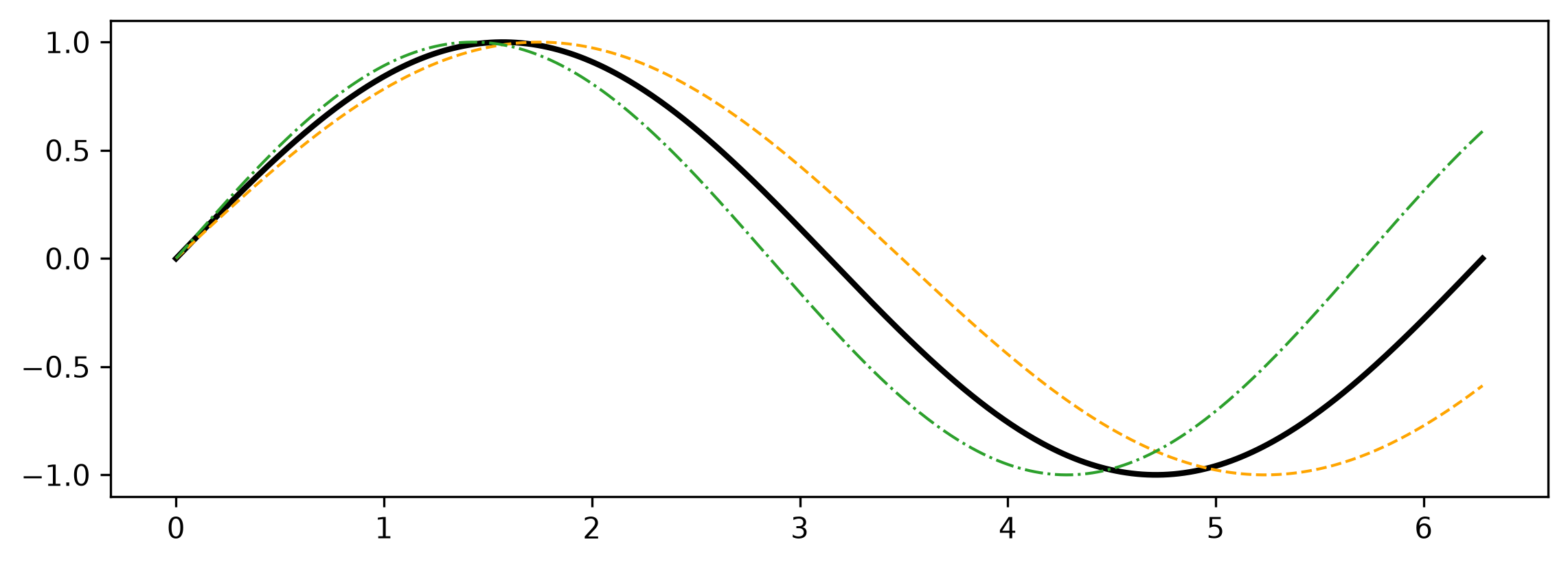
The color, marker, and linestyle can all be specified as a single string following the first two arguments.
Line plots created with np.linspace() usually have too many points for markers to be effective.
plt.plot(x, np.sin(x), "k-", linewidth=2)
plt.plot(x, np.sin(0.9 * x), color="orange", linestyle="--", lw=1)
plt.plot(x, np.sin(1.1 * x), c="C2", ls="-.", lw=1)
plt.show()
Legends
From the programmer’s perspective, it is clear that the orange line is \(y = \sin(0.9x)\), but without seeing the code that produced the figure it is still unclear which line means what.
Using the label keyword argument in plt.plot() attaches a name to a line.
After all lines are drawn, a single call to plt.legend() collects these names into a legend.
This function has a few important keyword arguments.
Argument |
Description |
Options |
|---|---|---|
|
Where to place the legend |
|
|
Number of legend columns |
|
|
Legend font size |
|
Like axis labels, legend labels can be entered in LaTeX.
plt.plot(x, np.sin(x), label=r"$\sin(x)$")
plt.plot(x, np.sin(0.9 * x), label=r"$\sin(0.9x)$")
plt.plot(x, np.sin(1.1 * x), label=r"$\sin(1.1x)$")

plt.legend(loc="lower left", ncols=3)
plt.show()

Problem 2
The Bernstein basis polynomials are a family of polynomials with certain properties that are advantageous for use in applications such as computer graphics. The five Bernstein basis polynomials of degree four are the following:
Plot these five Bernstein basis polynomials over the interval \([0, 1]\), as well as their sum:
Style your plot as follows.
Use a different color for each polynomial.
Use one line style for \(b_{0,4}(x), b_{1,4}(x), \ldots, b_{4,4}(x)\) and a different line style for the sum \(B_4(x)\).
Set the \(x\) limits to \([0, 1]\) and the \(y\) limits to \([-0.1, 1.75]\) to make room for a legend.
Label each polynomial and create a two-column legend in the upper right corner.
Label both axes and add the title “Problem 2”.
Create the figure in a single cell ending with plt.show().
Shaded Regions
Line plots show curves, but sometimes the important object is a whole region.
For example, we might want to show all points within a fixed distance of a curve.
The function plt.fill_between() shades in the region between two curves that share the same \(x\) values.
This function accepts keyword arguments similar to those of plt.plot().
y1 = np.sin(0.9 * x)
y2 = np.sin(1.1 * x)
plt.plot(x, y1, label=r"$\sin(0.9x)$")
plt.plot(x, y2, label=r"$\sin(1.1x)$")
plt.fill_between(x, y1, y2, color="C0", alpha=0.2, label="between")

plt.legend(loc="lower left", ncols=3)
plt.show()
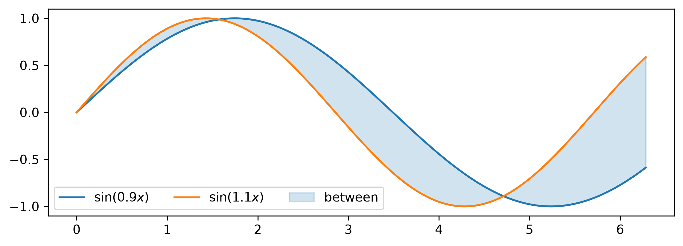
The alpha keyword sets transparency, from 0 (fully transparent) to 1 (fully opaque); a value such as 0.2 makes the shaded region light enough that the bounding curves remain visible.
Problem 3
The Squeeze Theorem says that if \(f(x) \le g(x) \le h(x)\) near \(a\), and if
then
Visualize the Squeeze Theorem for the functions
and \(a = L = 0\) over the interval \([-1,1]\).
Plot \(g(x)\) as a solid line.
Shade in the region between \(f(x)\) and \(h(x)\).
Set the \(x\) limits to \([-1, 1]\).
Label the \(x\)-axis and add the title “Problem 3”.
Create the figure in a single cell ending with plt.show().